


It is a major market risk for 2018 that nearly every major market pundit is talking about as we head into the New Year. It is the flattening yield curve. For if the yield curve becomes "inverted", then trouble is certainly ahead for the U.S. economy and the stock market. But does it? What exactly does a flattening or inverted yield curve really mean for the stock market investment outlook from an impact and timing standpoint? Let's take a closer look.
As The Story Goes
Before going any further, let's quick-walk through the narrative that is often expressed in the mainstream financial media. The slope of the yield curve is a predictor of future economic recessions and stock bear markets. Why? Because the yield curve has predicted seven out of the last seven economic recessions dating back over the past half century. Pretty good track record, right?
How does the yield curve predict a recession and a bear market? It inverts. This can be measured in many ways, perhaps most commonly through the 2/10 spread, or the yield on the 10-year U.S. Treasury (IEF) minus the yield on the 2-year U.S. Treasury (SHY). When the yield curve inverts, this spread goes negative with 10-year yields lower than 2-year yields. And the following chart shows how effective this reading has been over time in predicting each of the last five recessions dating back to the 1980s, for every time, the blue line falls below the black line, the yield curve inverts, and a recession as shown by the shaded box soon follows.
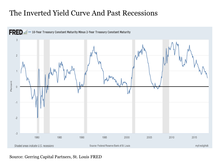
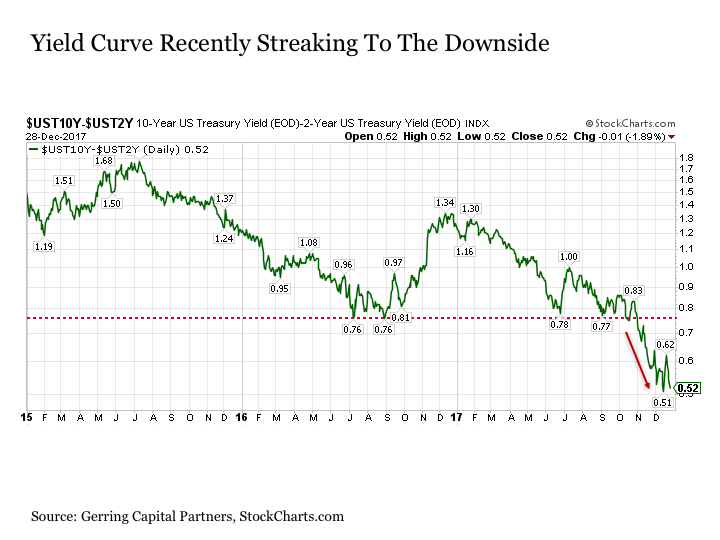
So where do we stand today? As shown in the chart above, the 2/10 spread is still positive at 0.53% as 2017 draws to a close. Not yet inverted, so stay long stocks (SPY) into 2018. But with that said, the 2/10 spread recently broke decisively through key resistance at 0.76% that had been in place since last summer and has been streaking to the downside ever since.
As a result, the yield curve may soon invert as we move through 2018, so mind your risk associated with your long stock (IVV) allocation and watch out for increased volatility (VXX) along the way.
Quite easily done, right? Let's go to commercial and call it a wrap without mentioning the recession and bear market that is likely to follow, for that sounds scary, and we can simply revisit this topic at a later date.
Oh, if markets were only this obvious. In reality, the considerations associated with the yield curve are far more nuanced than that.
Yield Curve 101
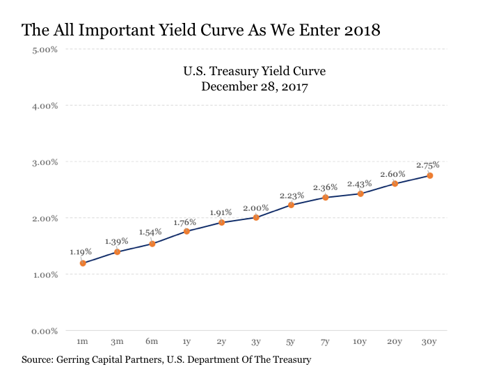
So, what is the yield curve, anyway? It is a curve that is created by plotting the current yield associated with U.S. Treasuries that mature anywhere between 1-month and 30 years from today. This is shown in the chart below as of December 28, 2017.
Why is it important? To simply the discussion, the yield to maturity for any debt security is determined by several factors, including the nominal risk free rate of interest (think the interest rate you could get from an FDIC insured savings account) as well as other factors such as inflation, default risk, liquidity, and time to maturity. Now, since liquidity in the U.S. Treasury market is abundant (you can easily buy or sell your U.S. Treasuries at any time) and the realistic risk of the U.S. government defaulting on the money that they have borrowed through the sale of U.S. Treasuries is virtually nil, the key determinants of the yield that investors are demanding at any given point on the U.S. Treasury yield curve is being driven largely by three factors: the current nominal risk free interest rate that is largely set by the U.S. Federal Reserve, investor expectations about inflation, and how long investors need to wait until maturity when they are repaid on their loan to the U.S. government.
So what exactly is happening when the yield curve is flattening? It implies the following. First, in regards to the point on inflation, that investors believe we are likely to experience in the future a period of disinflation where prices are rising more slowly than they are today or deflation where prices are falling instead of rising. As a result, investors are requiring an increasingly smaller additional yield over time to protect against what they perceive to be a diminishing inflation risk. Second, in regard to maturity, that investors are requiring less of an additional yield to lock up their money for a longer period of time to protect against the risk of interest rates rising in the future.
What then takes place when the yield curve falls into inversion? Put simply, investors are willing to receive a lower yield for a bond that is maturing at some point well into the future (i.e. ten years) than they could receive from a bond that is going to mature much sooner (i.e. one month, two years). This implies that they are receiving a negative inflation and/or maturity premium on their longer term U.S. Treasury investment.
Why on Earth would an investor want to be paid less in the future versus what they could receive today? Because they do not believe that today's higher interest rates are sustainable, so they are willing to lock in the lower longer term interest rate today under the belief that today's higher short-term interest rates could end up being much lower sometime in the near-term future. Why would they think this? Because they believe the economy may slow into recession, which will bring inflationary pressures and the stock market down with it.
Still not completely clear? Consider the following chart from November 16, 2006, the point of maximum yield curve inversion a decade ago, and less than 18 months later on March 8, 2008, as the economic and market lights were going out. On November 16, 2006, a bond investor would have passed on an immediate yield on a 1-month U.S. Treasury of 5.22% to lock in the long-term rate on a 30-year U.S. Treasury of 4.74%. While the decision might have seemed counterintuitive at the time, by March 8, 2008, when the 1-month Treasury investor has had to reinvest many times over and can now only get a much lower 1.73% yield, the 30-year U.S. Treasury investor has seen some modest capital appreciation with 30-year yields having fallen to 4.57% (remember that as yields fall, prices rise) while continuing to clip their higher coupon payments.
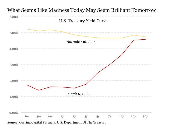
And how does this investor that opted to buy that 30-year Treasury yielding 4.74% back on November 16, 2006, feel about their investment decision more than 11 years later on December 28, 2017, with short-term interest rates only now just climbing off of the zero bound and 30-year Treasury yields (TLT) now down at 2.75%? Still very good about it after all of these years, as you've more than doubled the value of your investment over this time period and never had to crawl your way back from the abyss that was the financial crisis along the way.
Now that we've covered the details of what the yield curve is telling us, let's get back to our regularly scheduled programming.
Back To The Threat Of Inversion In 2018
Yes, the 2/10 spread has predicted each of the past seven recessions dating back to the late 1960s. But a count of seven is not what I would consider the most robust sample size in the world to draw any definitive conclusions on a high level basis. Moreover, while these past seven instances are also all the most recent, it should be noted that less than 50 years is really not all that long from an investment market history standpoint. Basically, these past seven instances encompass nothing more than just three secular market phases and just one currency regime (for you Bitcoin watchers out there, this is why the Bitcoin bubble is worth watching even if you have no intention of owning Bitcoin any year soon).
Fifty years not a long time, Parnell? Come on.
OK. Consider another example. Remember the universal refrain in 2005 and 2006 that house prices had never fallen nationally on a calendar year basis since World War II, a time period that encompassed more than 60 years at that point. Ah yes, long-term rules are made to be broken, and even longer term history should not be forgotten (remember what happened to home prices nationally prior to World War II? They fell. A lot.). And if the post crisis period has been anything, it has been a relentless rule breaker of various historical market patterns that were decades if not centuries in the making prior to the crisis.
10 Lessons On The Yield Curve For Today's Market
So what have we really seen from the yield curve over various market environments over long-term periods of time throughout history? And what are some other possibilities that we might take away from today's yield curve fast-tracking toward inversion?
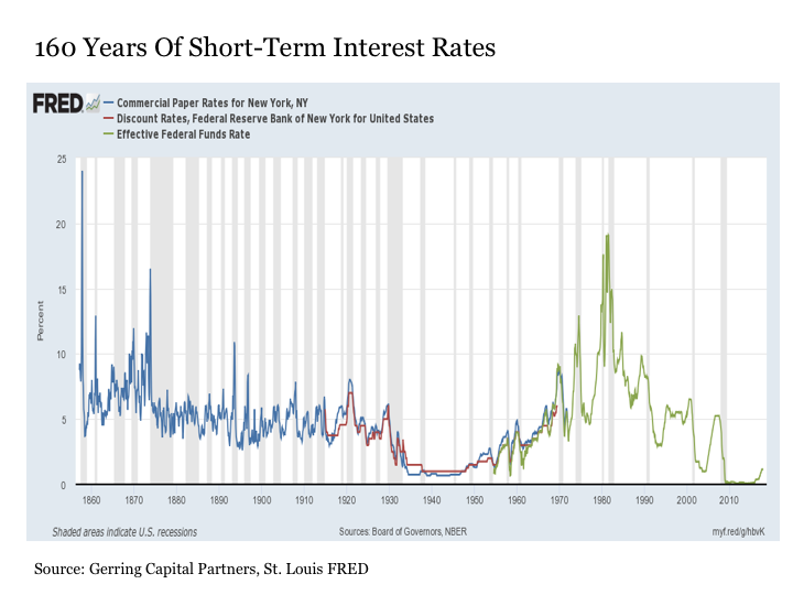
In order to answer this question, we first need to construct the historical data set to construct a yield spread that can invert. For short-term interest rates, let's use the effective fed funds rate. Now, it should be noted that this information dates back to July 1954, but we wish to go back further. For this, we will use the discount rates for the Federal Reserve Bank of New York, which dates from November 1914 not long after the advent of the U.S. Federal Reserve through July 1969. But we still want to go back further. For this, we will use the commercial paper rates for New York, NY, which date from January 1857 to December 1971. Now, we're talking about a long-term perspective.
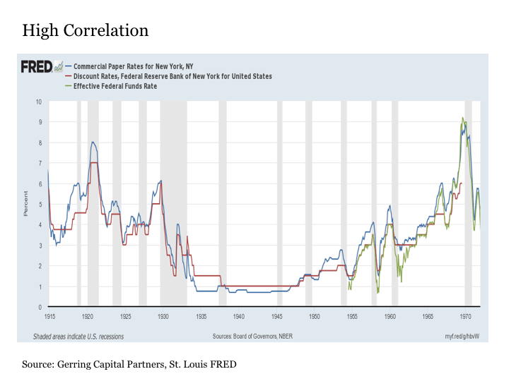
To highlight the correlation that exists between these three data series to justify their usage over time for a measure of short-term interest rates, the following chart shows their correlation over time during the period from November 1914 to December 1971 when at least two of these readings were in existence. While certainly not perfect, the correlation is sufficiently high to warrant their combined application for measuring short-term rates.
As for long-term interest rates, we will use the 10-year long-term interest rate as provided in the data from Robert Shiller from Yale University over the period from 1871 to the present.
With that, we have the ingredients to construct a spread between short-term interest rates and long-term interest rates dating back nearly 150 years and a time period that includes 29 U.S. economic recessions.
Pre-Fed: 1871 to 1914
The first time period to consider when viewing the yield curve through a more comprehensive lens is the pre-Fed period from 1871 to 1914. It is true that an inverted yield curve predicted each of the 12 economic recessions that took place during this 44-year time period (as well as the three recessions from 1857 to 1870 too - making for 15 recessions over a 58-year period). But it is also true that the inverted yield curve predicted just about everything during this time period, as the yield curve was perpetually inverted.
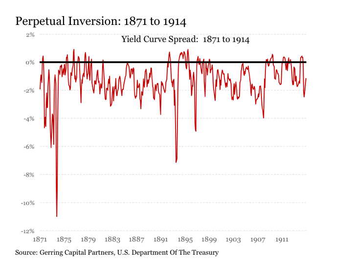
Why is this relevant today? Because it highlights a few key points. First, that an economy is capable of sustained growth over time, including a number of economic and stock market boom cycles along the way with a yield curve that is inverted. Also, it highlights the important role that the U.S. Federal Reserve plays in facilitating a market environment where short-term liquidity is more abundantly available in helping to provide a more consistently performing economy and markets over time. Now, one could certainly argue that they have taken this role way, way, way too far over the past decade or even three decades for that matter, but the pre-Fed period highlights what our economy might look like without the Federal Reserve. So while I am often critical of the Fed, it is in part because I expect so much of them given their critically important role.
Post-Fed: 1915 to Present
Now, let's focus on the just over a century since the Fed came into existence. This includes a time period with 17 recessions, including the seven most recent recessions frequently cited by commentators, including yours truly. Unlike the pre-Fed period, the yield curve is usually positively sloped with some notable exceptions. So, what does the inverted yield curve really tell us during these more recent episodes over the past century?
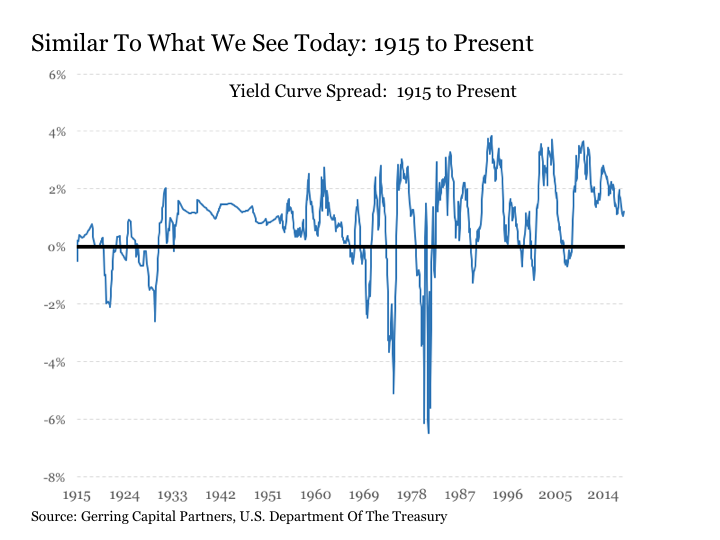
Let's start with the present and work our way backwards.
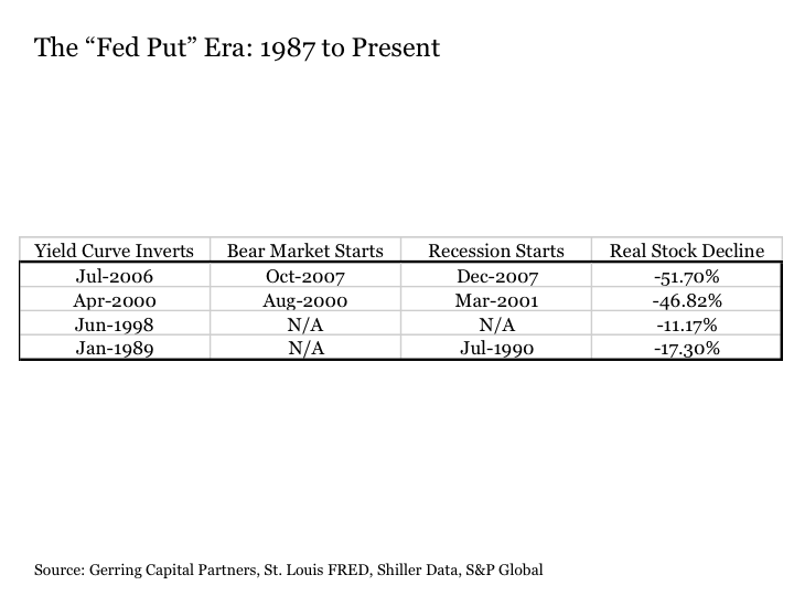
The last time the yield curve inverted in July 2006, the stock market peaked 15 months later in October 2007 and the economy officially entered into recession two months later December 2007. And when it was all over, the stock market (VOO) had fallen by more than -51% in inflation adjusted real terms.
This leads to our first key takeaway:
Lesson 1: Inverted yield curves matter, as a lot of investment value can be lost in the economic recession and stock bear market that may follow.
The previous yield curve inversion came in April 2000. Although March 2000 is commonly known as the stock market peak, in reality, stocks did not peak in real terms until four months after the yield curve inverted in August 2000. As for the economy, it did not fall into recession until a year later in March 2001. And it was a short and shallow recession that was over in November 2001 long before the bear market in stocks ended on a real basis in February 2003 down more than -46%.
Lesson 2: An economic recession is not a necessary precondition for a stock bear market. Stock investors lost a great deal of portfolio value despite the lack of any measurable economic decline, and the inverted yield curve predicted it months, but not years, in advance.
Let's keep going. The yield curve briefly inverted from June 1998 to December 1998 before turning back positive. This, of course, was the Long-Term Capital Management episode when the near collapse of the now notorious hedge fund threatened to push the global financial system off of a cliff (seems quaint now in the aftermath of the financial crisis - such is the consequences of accumulated moral hazard as we look forward into the 2020s). During that time, there was no economic recession, and there was no bear market, as the Fed rode to the rescue with a bailout of LTCM that postponed the pain that eventually struck two years later in 2000.
Lesson 3: An inverted yield curve does not necessarily imply the onset of an economic recession or a bear market, as monetary policy-makers may have the ability to overpower it. That's if the problem is manageable and isolated enough (true in 1998, not so much in 2008).
The next previous yield curve inversion started in January 1989. The stock market peaked seven months later in August 1989, and the economy eventually fell into recession in July 1990 more than a year and a half later. Overall, the stock market dropped by -17% on an inflation adjusted basis before finally bottoming in October 1990 right in the middle of the 1990-91 recession that ended in March 1991.
Lesson 4: Building on lesson 2 from above, yield curves often predict bear markets that often predict economic recessions. Thus, those waiting to see the whites of the eyes of the next economic recession before concluding a bear market is upon us are also likely those that are most likely to get trapped in the next bear market.
How about the stock market (DIA) crash of 1987? The yield curve did not invert prior to this episode, nor did the economy fall into recession in its aftermath.
Lesson 5: The market does not need an inverted yield curve or a looming economic recession for really bad things to happen to the stock market at any given point in time. But the lack of a preceding inverted yield curve may signal the market's resilience to recover more quickly from such traumas than it might otherwise.
Let's keep going further back to the next four yield curve inversions from January 1969 to February 1982 and view them as a set.
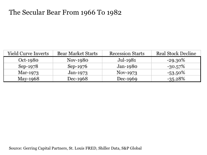
In many respects, the table above speaks for itself. So, let's get right to the lessons.
Lesson 6: As evidenced by the 1980 episode (and also arguably true of the 2000 episode), while an inverted yield curve may predict the onset of an economic recession, it may occur simultaneously to the start of a stock bear market.
Lesson 7: As evidenced by the 1973 and 1976 episodes, while an inverted yield curve may predict the onset of an economic recession, a stock bear market may already be underway as much as a few months to a few years ahead of the yield curve inverting.
Lesson 8: Challenging the absolute notion that stock prices always rise over time, the secular bear market from 1968 to 1982 that included four separate inverted yield curves, bear markets, and economic recessions saw stock prices continuously fall on an inflation adjusted basis with lower highs and lower lows after each successive episode with stocks losing a cumulative inflation adjusted -63% over this 15-year time period. This is a long time and a lot of real lost value. In fact, stocks may not always simply rise over time.
Further back, we go to the next set dating back through the onset of World War II.
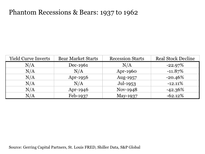
A bear market in stocks began in December 1961 and continued through June 1962 with stocks losing -23% of their value. Yet the economy did not go into recession following this bear market, and the yield curve did not invert surrounding this time period.
Now, the economy did go into recession in April 1960. And this was preceded by a stock market peak in July 1959 with a correction that lasted over a year but only took -12% off of the benchmark index. Yet the yield curve also did not invert prior to this episode.
We had the onset of a bear market in April 1956 followed by a recession more than a year later in August 1957. Overall, the stock market dropped by more than -20% on a real basis before finally bottoming more than a year later in November 1957. Yet the yield curve did not invert prior to this recession and bear market.
In July 1953, we had the start of a recession that lasted nearly a year through May 1954. And while the stock market peaked in January 1953 roughly six months in advance and declined by -12% before bottoming in September of that year, once again the yield curve never inverted.
Next, there's the immediate post World War II period from 1946 to 1949. The U.S. stock market peaked in April 1946 and started falling. A recession started more than two years later in November 1948. The stock market finally bottomed in June 1949, having lost more than -42% of its value on an inflation adjusted basis. Yet, the yield curve once again never inverted.
Lastly, we have the granddaddy of no yield curve inversions of them all. Back in February 1937, the stock market peaked and a new bear market began. In May 1937, a recession started that lasted through June 1938. The stock bear market continued beyond the end of the recession, however, through May 1942 when it finally bottomed more than five years later having fallen by -62% on an inflation adjusted basis. A long and deep ouch.
Lesson 9: Historical precedence exists covering a quarter of a century of economies falling into recession and/or stocks falling into bear markets where the yield curve never inverted prior to their onset. When did these take place? During periods of extreme fiscal and monetary policy intervention when long-term interest rates were held artificially low. Sound familiar?
We finish with our final grouping from 1915 to 1932, which represented a return to business as usual for the inverted yield curve with a twist.
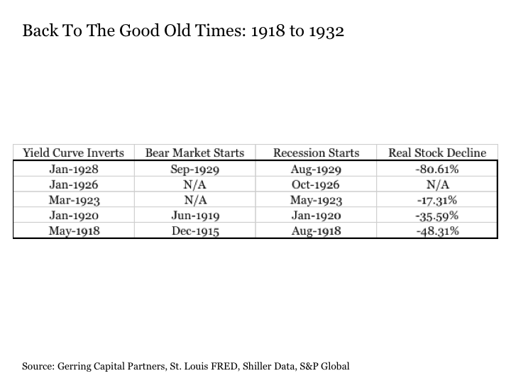
In each of the five recessions or depressions (1920-21, 1929-32) that took place during this time period, the yield curve inverted at least simultaneously if not a few months in advance of the onset of an economic recession.
The twist? While full blown bear markets came with the first two recessions and started well in advance of the yield curve inverting in both instances, the next two yield curve inversions and recessions came and without a bear market. The 1923 recession saw a brief -17% correction, while stocks simply blew higher right through the 1926 recession. Then, of course, came 1929 and the four tortuous years that followed and which were filled with policy mistakes that took the stock market lower by more than -80% on a real basis. Another long and deep ouch.
Lesson 10: Similar to what we saw in the early 1990s, history has brought us extended periods where yield curves have inverted and economies have fallen into recessions, yet bear markets have been skipped. But what history showed us somewhat in 2000 but much more so in 1929 is that when yield curves invert and economies recede without commensurate stock market pain, that excesses can accumulate to the point where they can finally boil over in a meaningful and damaging way.
The Bottom Line
Much is being made about the flattening yield curve and its potential inversion in 2018. And rightfully so, for the inversion of the yield curve has traditionally provided a reliable leading indicator that an economic recession lies ahead in the coming months.
But an inverted yield curve is not necessarily an ironclad predictor of an oncoming bear market, as four of the past 17 stock bear markets were under way before the yield curve ever reached an inverted state.
And if policy has distorted things enough and interest rates across the yield curve are sufficiently low, we may see the onset of an economic recession and/or the start of a bear market without the yield curve ever inverting, which happened another six times in recent history since World War II.
Also, beware the inverted yield curve head fake, for if policy-makers are determined enough as they were in 1998 and as frothy as the market was in the 1920s, the economy and or the stock market can blow right through it. For a time, that is.
Finally, I often hear on the financial media how we are not at risk of a bear market because there is no economic recession in sight. Unfortunately, the reliance on such a notion is fraught with future stock investor pain, as each and every bear market dating back over the past century preceded its accompanying recession by months if not years in every single case. Moreover, history has shown that we can have a full blown bear market in stocks with barely a recession if any at all.
So, watch the yield curve and its potential inversion closely in the coming year, for it is an important indicator of what likely lies ahead for the U.S. economy and what may be happening in the U.S. stock market today if not in the recent past. But do not simply relying on an inverted yield curve as your primary indicator that it is time to take more evasive action with your stock portfolio in what is currently the second longest stock bull market in history, for it may leave you and the value of your portfolio feeling a great deal of pain at the end of the day.
Choose your risk metrics carefully and monitor them closely. But make certain that the number of risk metrics that you are monitoring is a sufficiently large population and work to know exactly what each of them may or may not be telling you at any given point in time. This includes the all-important and much discussed yield curve.
Disclosure: This article is for information purposes only. There are risks involved with investing including loss of principal. Gerring Capital Partners makes no explicit or implicit guarantee with respect to performance or the outcome of any investment or projections made. There is no guarantee that the goals of the strategies discussed by Gerring Capital Partners will be met.
Special Offer Ends Sunday At Midnight: The Universal is my premium service on Seeking Alpha designed to generate consistent returns and attractive income over time while also protecting your hard-earned savings through any future bear market. On January 1, 2018, the rates for new subscribers to The Universal will be going up to $67 per month or $497 per year. But for those that are members prior to the start of the New Year, they will lock in the current lower rate of $49 per month or $399 per year for the life of their subscription. To learn more or to sign up for a two-week free trial, please click on the link for The Universal. Questions? Send me a message and I will follow up. Thanks!
Disclosure: I am/we are long TLT,IEF,RSP.
I wrote this article myself, and it expresses my own opinions. I am not receiving compensation for it (other than from Seeking Alpha). I have no business relationship with any company whose stock is mentioned in this article.
Additional disclosure: I am long selected individual stocks as part of a broadly diversified asset allocation strategy.