最新文章
文章分类
归档
2005 (1235)
2006 (492)
2007 (191)
2008 (735)
2009 (1102)
2010 (315)
2011 (256)
2012 (203)

正文
Last week’s discussion on the size of the bailout expenditures generated some interesting buzz. A few others picked up on the size, and created a few different ways to depict the amount of money involved.
These have been my favorites:
>
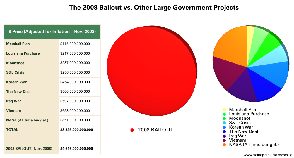
Bailout Pie Chart
chart courtesy of voltagecreative
>
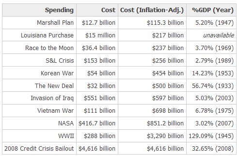
Prior Bailouts as a % of US GDP
via mindtangle (note that this data is already old!)
>
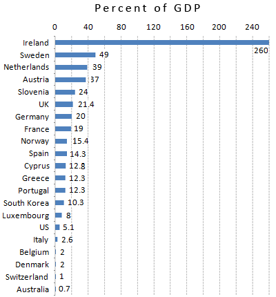
Global Bailouts per National GDP
chart courtesy of Portfolio
>
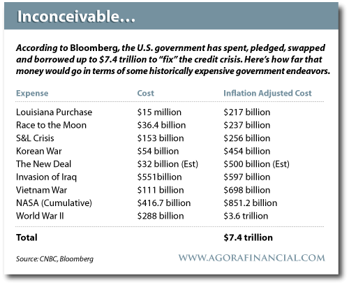
via Agora Financial
评论
目前还没有任何评论
登录后才可评论.


