


2010 (5)
2011 (2)
2013 (42)
2015 (93)
2016 (126)
2017 (121)
2018 (90)
2019 (105)
2020 (233)
2021 (239)
2022 (249)
2023 (295)

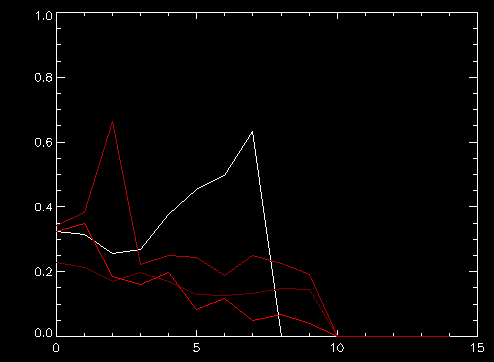
The plot shows the relative increase of new patients each day, starting from about the same stage (about 1500 patients). You can see Korean has been quite successful to cut the rate of increase significantly in 10 days (ignore the last point that drops to zero). Italy (dark red) made some progress but then stalled . 近五天没有进步。 西班牙也是只有微小改善。
美国(白色)目前比那几个糟糕得多,不明白为什么。应该是因为人口比较稀少不应该增加这么快,但是却更坏。
欧洲美国如果不能在两周之内把单日相对增长率降低到0。1以下,会有上百万的病人。那时候再搞什么呆家里隔离已经没什么意义,不如大家出来该干什么干什么,有一部分人生病也只好由它去了。