


Rare Shift In NYSE Buy Signals
A rare shift recently took place in the NYSE Bullish Percent Index. According to stockcharts.com:
The Bullish Percent Index, or BPI, is a breadth indicator that shows the percentage of stocks on Point & Figure Buy Signals. There is no ambiguity on P&F charts because a stock is either on a P&F Buy Signal or P&F Sell Signal. The Bullish Percent Index fluctuates between 0% and 100%. In its most basic form, the Bullish Percent Index favors the bulls when above 50% and the bears when below 50%.
In late December 2018, the NYSE (VTI) Bullish Percent Index reached an extremely low reading of 19.16. As shown in the chart below, that level has only been reached in four other periods: 1987, 1998, 2008-09, and 2011. In the 2018-2019 case, it took only 65 calendar days for the NYSE Bullish Percent Index to climb to 61.96.
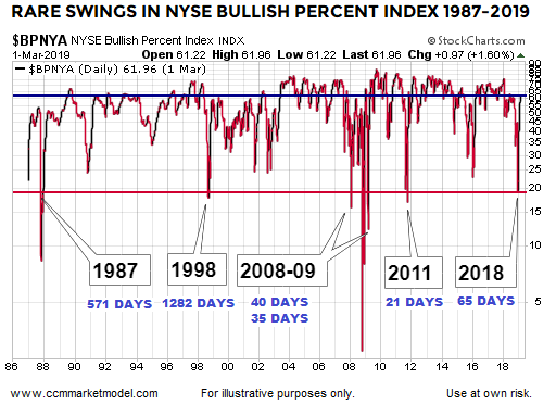
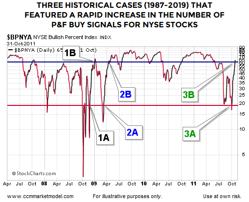
The only other shifts that occurred in under 100 calendar days took place in 2008, 2009, and 2011. In the chart below, the 2008 case is denoted by 1A and 1B, the 2009 case by 2A and 2B, and the 2011 case by 3A and 3B.
What Happened Next?
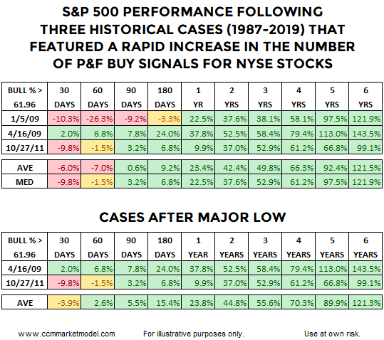
The first table shows S&P 500 (SPY) performance for all three cases after points 1B, 2B, and 3B. The second table shows S&P 500 performance for 2 of the 3 cases. The message from both tables is while givebacks and volatility could be part of the equation over the next 60-180 days, historically, in all three cases, S&P 500 performance was extremely satisfying over the next six years. Since we know 2019-2025 will follow a unique path, the historical cases simply help use assess probabilities in the days, weeks, months, and years ahead.
Comparing All Cases To 2019
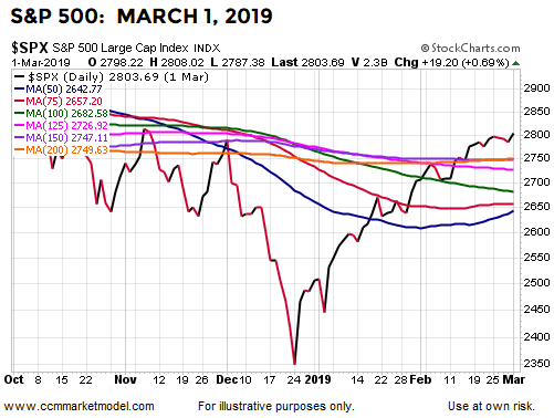
Given the S&P 500 (VOO) was 26.3% lower 60-days after the NYSE Bullish Percent Index climbed back to 61.96, it is probably fair to say 1/5/2009 is the most concerning historical case. How does the market’s profile on 1/5/2009 compare to the profile on 3/1/2019? The chart below shows the S&P 500’s 50, 75, 100, 125, 150, and 200 day moving averages on 1/5/2009.
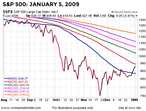
The chart below shows the same moving averages on 3/1/2019, the day the NYSE Bullish Percent Index hit 61.96. The market’s profile was much stronger in the 2019 case relative to the 1/5/2009 case, meaning the odds of a another leg down were quite a bit higher on 1/5/2009.
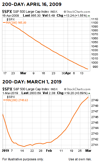
How does the 3/1/2019 case compare to the 4/16/2009 case? As shown via the charts below, the market’s long-term profile on 4/16/2009 was quite a bit weaker than the profile on 3/1/2019.
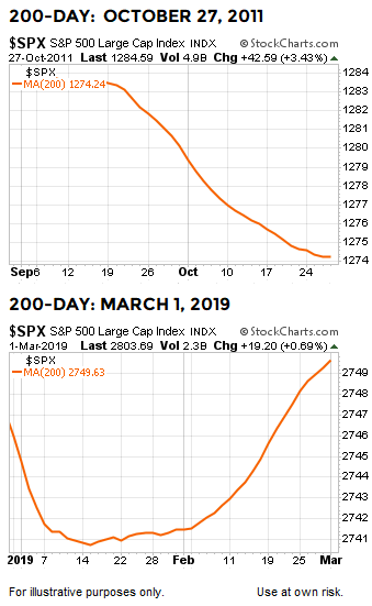
How does 2019 compare to the 10/27/2011 case? Once again, the market’s 2019 profile was stronger on the day the NYSE Bullish Percent Index climbed back to 61.96 relative to the same milestone date in 2011. The strength of the market’s profile speaks to the odds of a significant (10% plus) pullback in the stock market.
What Transpired In All Cases?
Since the NYSE Composite Index contains approximately 1900 stocks, a shift in the NYSE Bullish Percent Index from below 20 to above 60 means the shift in bullish conviction was strong enough and broad-based enough to push approximately 760 stocks from P&F sell signals to P&F buy signals. It is very difficult for a shift of this magnitude to occur without the backing of large institutions. In all the historical cases, when a similar institutional shift took place in the market, stocks (IVV) were higher six years later by an average of 121%. A similar shift took place between December 2018 and March 1, 2019, telling us to keep an open mind about much better than expected long-term outcomes in the stock market. Historical performance in the first 180 days also reminds us to have realistic expectations about red days, red weeks, and red months.

The Weight Of The Evidence
Data is only available for the NYSE Bullish Percent Index dating back to 1987, which means any rare event will be based on a small sample size. However, this week’s video provides additional evidence from other sources dating back to 1950 that paints a similar be open to better than expected long-term stock market outcomes picture.
Charts cannot predict the future; they simply help us assess patterns in human behavior from a probability perspective. The data we have in hand as of April 30, 2019 aligns with the possibility of better than expected outcomes. As long as that is the case, we will allocate accordingly. If present day data shifts in a meaningful way, we will reassess the odds and make adjustments to our asset mix if needed.
Disclosure: I am/we are long SCHX. I wrote this article myself, and it expresses my own opinions. I am not receiving compensation for it. I have no business relationship with any company whose stock is mentioned in this article.


There was also a farmer making the investment adviser circuit who said he could tell the market by how his chickens were laying. My bet is that you never heard of him recently because he was probably running on coincidence not cause. Charts can go like that.
Coincidence is not causal. While there are reasons for the author's charts, I like to know what i am paying for stocks vs interest rates. I need to know practical info that makes a difference in the long run.
I Buy cheap and sell only when i need the expenses or the fundamentals are much worse than average (market peaks with high P/E and sentiment high with no cash on the sidelines). By fundamentals i do not mean the cherry picked facts that permabears state.
I mean the GAAP earnings, interest rates, GDP, PMIs and various employment stats vs similar economic times in other decades . Would you buy a mom and pop store based only on a few charts?

In the title,: "Flashed Only 3 Times" would be better than "Only Flashed 3 Times."


Thanks for the info, nice work.