


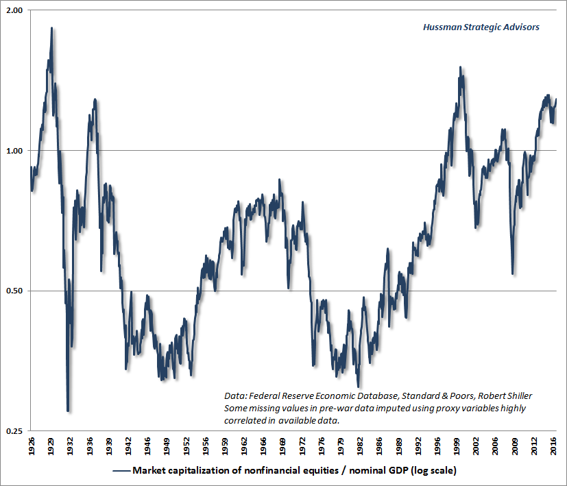
Looking out on a longer-term horizon, the following chart shows the ratio of nonfinancial market capitalization to nominal GDP, where we can reasonably proxy pre-war data back to the mid-1920’s. Our preferred measure is actually corporate gross-value added, including estimated foreign revenues (see The New Era is an Old Story), but the longer historical perspective we get from nominal GDP is also valuable. The chart shows this ratio on a log scale. To understand why, see the mathematical note at the end of this comment. The recent speculative episode has brought this ratio beyond every extreme in history with the exception of the 1929 and 2000 market peaks.
As I’ve often emphasized, one of the most important questions to ask about any indicator is:how strongly is this measure related to actual subsequent market returns? Investors could save themselves a great deal of confusion by asking that question. Hardly a week goes by that we don’t receive a note asking, for example, that “so-and-so says that earnings are going to strengthen in the second half - doesn’t that make stocks a buy?” Well, it might, if year-over-year earnings growth had any correlation at all with year-over-year market returns (it doesn’t), or if there was evidence that earnings tend to strengthen in an environment where unit labor costs are rising faster than the GDP deflator (they don’t). That’s not to say that we can be certain that earnings or stock prices won’t bounce, but we can already conclude that so-and-so hasn’t convincingly made their case. When investors ignore the correlation between indicators and outcomes, they make themselves the victims of anyone with an opinion.
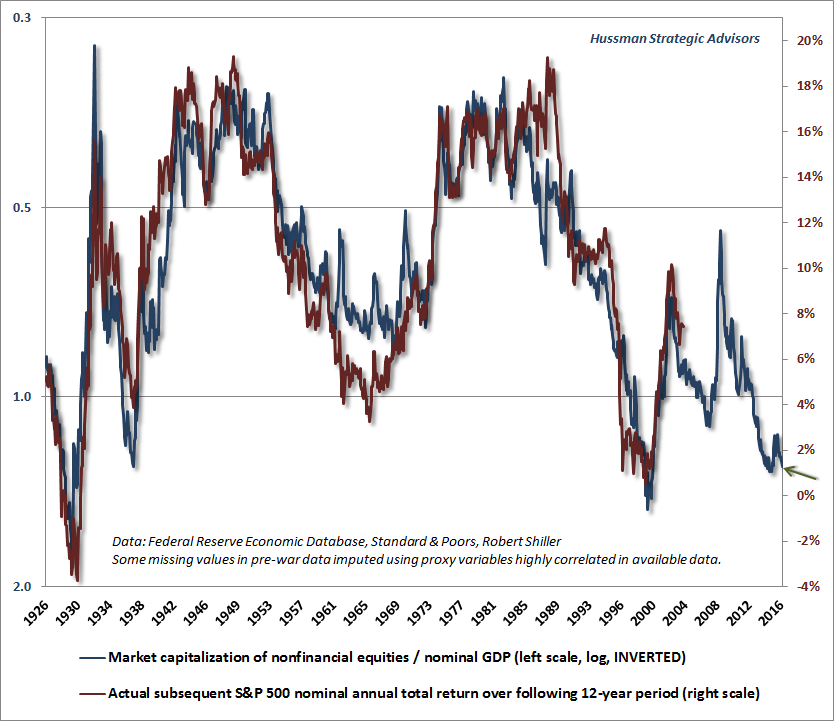
The chart below shows the same data as above - the ratio of nonfinancial market capitalization to nominal GDP - but uses an inverted log scale. The red line is the actual subsequent total return of the S&P 500 over the following 12-year horizon. We use that horizon because that's the point where the autocorrelation profile of valuations hits zero (seeValuations Not Only Mean-Revert, They Mean-Invert). The chart offers some sense of why Warren Buffett, in a 2001 Fortune interview, called this ratio “probably the best single measure of where valuations stand at any given moment.” Again, we prefer corporate gross value-added, but at that point, we’re quibbling over a 91% correlation and a 93% correlation with subsequent 12-year market returns. Buffett hasn’t mentioned this measure in quite some time, but that’s certainly not because it has been any less valuable in recent market cycles. As I’ve frequently observed, it’s fine to assert that stocks are “fairly valued” relative to interest rates here, but only provided that “fair” is defined as an expected nominal total return for the S&P 500 averaging about 1.5% annually over the coming 12-year period.
It’s not a theory, it’s just arithmetic
Understand that valuation levels similar to the present have never been observed without the stock market losing half of its value, or more, over the completion of the market cycle. We’ve periodically heard analysts talking about stocks being in a “secular” bull market that presumably has years and years to go. These analysts evidently have no sense of what drives such secular market phases.
Source: John Hussman